Labels

Sunday 6 May 2012

Final Arkitekt DPS layouts!


Here are my final designs for the Arkitekt magazine...
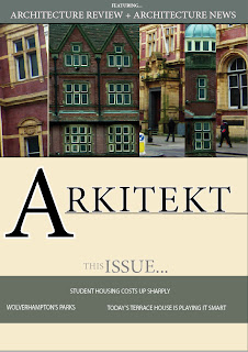

(Front cover)

I have altered my spreads in various ways, for example the colours are more neutral and allow the overall appearance to appear more professional. Also I have elongated the photos on the front cover, which are now more prominent.


(Architecture Review DPS)

I have included tabs along the left hand side of the page, which makes the entire composition look as though it belongs in a magazine. I have also removed the dark blocks which surrounded the text, as I felt that they were too overpowering for the spread.


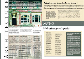
(Architecture News DPS)

I have used only one copy of the house at full opacity, as the second lowered opacity copy didn't relate to the article or have much relevance. Instead I have decided to incorporate an image of a georgian hotel, which is located directly behind the georgian architecture article. The spread is easier to understand this way, and allows the reader to navigate around the page effectively. I am pleased with the end result, as the colour theme and typeface choices are some features which make the magazine appear interesting and contemporary.


Friday 20 April 2012

Creating the interface!


This is a print screen of my interface that I have designed to accompany my animation. When the viewer hovers over the door, it swings open and reveals a 'Main animation' play option. I have tried to make the entire concept relevant to the nature of my animation, by including elements like the black and white town scenery.

It was designed within photoshop first, then imported into flash to be edited as an interface which includes interactive buttons. All I need to do is link all my files and im done! :)

Tuesday 10 April 2012

Main animation shooting!


(I shot my animation inside my fold-out photography tent, using  powerful lights and a webcam attached to a tripod)


(I was able to monitor every shot onscreen, which proved very helpful as I could identify mistakes instantly and make the necessary corrections)


(The animation tent from a birdseye view - My two 'city' scenes!)


(The main shooting)


(Starting scene)


(Middle scene)


(Ending scene)

The entire filming process was made fairly easy with my HD webcam. It took 5 hours to capture almost 740 shots, this may seem like alot but I wanted only very subtle movements to ensure that the film would run smoothly. I used lighting adjustments on the webcam to control the nature of the atmosphere and visual appearance of the scenes. I swapped the day scene with the night scene around halfway through the animation, purely for a more interesting contrast...I really like the creepy shadowy effect! :)  


Sunday 1 April 2012

Final DPS indesign practice!


(Title page 'Arkitekt')


(Architecture review DPS 1)

(Architecture news DPS 2)

After some consideration of the design of my layouts, I used Indesign to inject some more exciting visual elements into them. Instead of using my sketches, I decided to enhance my work by adding the photographs I took but with a high level of contrast. I have also tried to use a colour scheme which appears consistent throughout all of the pages, indicating they are part of a set. My use of photographs has improved my DPS layouts, as they look more formal and appropriate for a magazine. 

After my discussion session, I was advised to reconsider my choices of typeface. This is because it needs to be aimed at the target audience more effectively, and the current choice seems lacklustre.
Jeff advised that I be more experimental in terms of composition and colour, two elements that I will take into account when designing my next series of new and improved DPS layouts!   

Final rendered storyboards

('Daytime phase' storyboard)


('Night time phase' storyboard)

After spending many of my Dynamic imagery sessions learning how to create animation in flash, here are my final storyboards for my sequence. They explain in detail the key stages of my animation, and how they unfold gradually. Although these took many hours to complete, I am satisfied with the end result.

My next intention is to shoot the scenes as they appear in my storyboard, using my mini photography studio which comes complete with a tripod (which will prove to be very handy for filming my animation as accurately as possible!)

Friday 16 March 2012

Initial DPS's


I started using Indesign after one of our practice sessions, and began to arrange the text in various ways. I experimented with type and constructed some initial layouts. I also decided to incorporate some of my architecture sketches into it, however they don't look as professional as I suspected they would. Perhaps I could later use them in my ideas, but in a much more subtle manner?


These Indesign layouts are for the carbuncles text, this time using my images but only in a small area. I think that these layouts are good for initial text positioning experimentation, however they will need editing to allow for a more colourful visual appearance...

Tuesday 13 March 2012

Initial storyboards and scenery mock ups...


(Initial storyboards)


(Mock up scenery practice)


In order to show my intentions for my animation sequence, I created some rough practice pieces for the scenery. I used 3D pop up scenes, whilst incorporating some of the objects I plan to use for my work. These will include:

A set of coloured chalks
White sticky squares

The original intention was to include tubes of paint, that would become a part of the animation by filming the acrylic being squeezed out of the tube and making the markings for the roads on the pop-up sets. However I have decided to not include this, as I don't want to overcomplicate matters. I am aiming for a very simplistic, yet effective look! 

I enjoyed experimenting with different light sources, and developing a storyline for my animation is exciting work! :)


Saturday 10 March 2012

Inside and outside...


For my visual communication module, I am required to identify letterforms within both interior and exterior environments and take photographs. I explored the forest area near to my house, and also my bedroom which contains lots of letterform-style objects. Here are some of the shots i managed to gather.


('The Albion' pub near my home)


(Wall engravings on a small abandoned building within the forest)


(A tree shaped similar to a 'V' letter)


(Graffiti markings on a building in the forest)


(Perfume bottle on my bedroom shelf, unusually shaped)


(Mannequin figure on my bedroom desk)


(Open magnifying lamp which indicates the letter 'O')


(Rounded mirror in my bedroom)


('F' shaped bedroom shelf)

These are some of the best photos that I took for the project. Altogether I took around 30 shots, which I am required to import into Imovie and edit into a video with an accompanying soundtrack. I chose 'Bella's Lullaby' from the film 'Twilight', which is a slow piano instrumental track. I chose it because it suits the peaceful pace and nature of my images, and it seems to work well when I test it as a whole piece in Imovie.

Wednesday 22 February 2012

Mindmaps and idea generation!


(Animation mindmap)


(Initial idea sketches)

After weeks of learning the basics of Adobe flash, I have finally been assigned my main brief for the Dynamic Imagery module - Animation! I am required to produce a video that is a minimum of 1 minute in length, and has a narrative with accompanying sounds. I began by brainstorming 'Narrative' and all the things I could associate with it. I sought inspiration from the internet in terms of youtube videos, and found some that captured my attention. 

I also created a sheet of initial sketch ideas with a small mind map, further communicating my intentions for the animation.   

Wednesday 15 February 2012

Magazine layouts for inspiration


In order to gain a sense of how architecture magazines are structured compostionally, I went out and purchased a copy of 'Blueprint' architecture. Here I have selected some of the most inspiring, colourful examples of layouts which I will use for inspiration within my work.

I like the contrasting elements within this piece. The thick coloured borders suggest a more modern style of design, which looks quite effective. Also I like how some images are kept boxed and constrained, whereas others are almost free-floating on the page. This ensures the layout doesn't appear too chunky or tightly structured.

(Thumbnails for DPS)


Here are some of my Initial thumbnails. I selected various elements that I thought were interesting in the Blueprint magazine, and recreated them on layout paper. During feedback sessions I was advised to do more free-hand layouts to allow for more flexibility with my design work. I find working free-hand quite difficult, however I will try to get into the habit of not using a ruler!

Wednesday 8 February 2012

Exploring Wolverhamptons architecture...


('The Royal London' pub)


(Railway station carpark - Modern Brutalist)


(Old post office - Victorian)


(Chubb's Lock - Victorian)


(Molineux Hotel - Georgian)


(Observational architectural sketches)

For my 'Experimental Type' brief, I am required to produce a front cover and 2 DPS layouts for a magazine called 'Arkitekt'. It is based on architecture and aimed at aspiring architects and designers, and my aim is to create a display of contemporary pages. I started out by exploring the local city of Wolverhampton's buildings, and studying the various architectural elements within them. Above are some of the best photographs I took, and I also did some observational drawings of some key features.