Labels

Sunday 13 November 2011

Showbiz time!


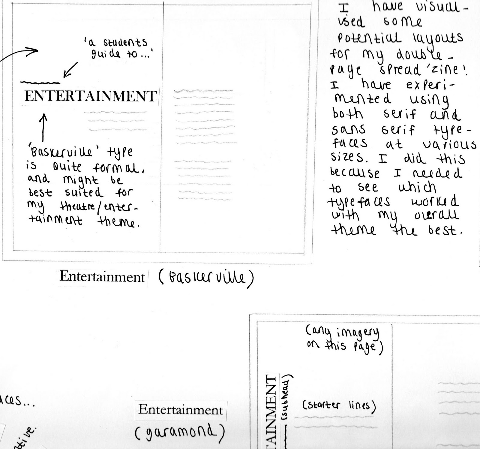
I sought advice from the course leader Jeff leak, who advised me to explore a site called 'fontsquirrel' which proved to be extremely useful for the development of my work. He suggested that I should perhaps reconsider my typeface choices, as they did not seem suitable for my theme. Jeff looked at my initial layouts and advised me to alter my alignments, and perhaps take my theatre theme into more consideration. I drew up some potential improved layouts, and then created them in Indesign...


I decided to explore some of the exciting typefaces on the Fontsquirrel website, and download them for my own personal reference. I then incorporated some of them into my layouts, which enhanced the appearance and overall composition of my ideas. I feel that I have been able to progress much more this week with my work, and I am more confident when experimenting with new possibilities.


I wanted to reflect the showbiz glamour and excitement of the theatrical experience through my layouts. I started by experimenting with the curtain lines in photoshop, using gradients to give a more realistic impression. This gives the entire piece a more themed, professional look. I added subtle elements that are reminiscent of theatre architecture such as spotlights, and I incorporated bordered boxes outlined with dots for text. This design is much more imaginative than my previous ones, however I think that compositionally it is weak. The layout of text could be more well considered.


For this layout, I used a fontsquirrel typeface called 'Impact label' which places a dramatic poster-style black box around text. I wanted to enhance certain keywords, like the titles 'Grease' and 'theatre experiences'. I chose the 50's style 'brush script MT' main title typeface because it brings a fun, quirky quality to the appearance of the layout. Each section of words is presented at a certain angle on the pages, communicating a dramatic 'broadway advertisement' impression. This layout is the most exciting, and the most successful. However, I still feel that it needs to be adjusted slightly to fit the brief criteria.


The next step is to tackle part two of the brief, which will involve creating an A4 size front cover for my DPS spread. I will experiment with some thumbnail visual ideas this week!

Monday 7 November 2011

Final DPS layout practice

Indesign DPS layout Ideas...

After experimenting with typefaces and compositional factors on my initial design sheets, I decided to begin applying these ideas to an Indesign layout format. I used important elements such as specific theatre show titles and decorative theatre pattern to communicate my theme. Some of the text was intentionally made more prominant to catch the viewers eye, in a very exaggerated showbiz fashion...

(Initial DPS layout idea)
I think that this first draft is weak in terms of composition and excitement. The text seems randomly placed, and could be positioned more appropriately in relation to the theme. I think that the 'pristina' typeface works well for communicating the grand, fancy element of theatre architecture. I also think that the gradual incline of paragraph text above the theatre seat image is unusual and thought provoking.


(Developed DPS layout idea)
This DPS layout is an improved version of the first. This time I have paid closer attention to the hierachy of the piece, and how it could be used to enhance more important keywords. These will provoke interest from the viewer, and encourage them to read further. Words such as 'excitement' and 'experience' are printed in a larger typeface, to contrast with the rest of the text. These subtle changes make this layout more successful, and more easily readable to the audience.


(Final DPS layout idea, combination of both serif/sans serif typefaces used)
This is a more finalized version of the previous layout. I thought that the right-hand page of the DPS lacked consistent content, and there appeared to be little connection between the two adjacent pages. I chose keywords from the paragraphs and increased the size and thickness of the typeface. Then I positioned these letters in the empty area on the right-hand page to create a consistent spread of text. The theatre seat image is positioned at a slight inwards angle, which leads the viewers eye into the opposing pages content. The pristina/century gothic typefaces used are maintained throughout the DPS, and allow for a subtle simplicity. Although this layout is the most successful yet, I still feel that there are compositional/typeface elements which could be improved in further design layouts.

My next step is producing a final outcome visual for my DPS freshers zine, which I hope to complete within the next few days! :)

Experimenting with typography layouts...

In response to my theatre research, I came up with some potential DPS layouts on marker paper. I tried to experiment with typefaces, colour, and composition. Here are some of my initial ideas...

(Basic layout for DPS spread)

(Red coloured theatre-themed DPS layout)


I tried to vary the stroke thickness and texture of the type, to best communicate my theme effectively. Through each layout I have tried to incorporate an interesting architectural theatre element, to show my concept ideas. I have produced many varying visuals, which are each differently displayed for experimentation purposes. During this exercise, I came up with some interesting ideas for the final DPS layout. I have tried to take certain elements (like type size/alignment) into account for later use.