Labels

Sunday 11 December 2011

Final outcomes....

Horizon Titlepage

After much consideration of my thumbnail visuals and ideas, I eventually produced my 'Horizon' student zine titlepage. It consists of a very theatrical-style theme, with a unique contemporary twist that is aimed at fellow young freshers students. The bold 'Horizon' heading is positioned on the left hand side, with wide spacing inbetween each letterform. The unusual nature of the typeface adds to the modern look of the zine, and effectively communicates what exciting entertainment the City of Wolverhampton has on offer for students!
'Hello and Welcome' DPS

This is my final design outcome for my 'Hello and Welcome' DPS. It is simple yet effective, and includes some formal subheadings which work well in contrast with the Century Gothic typeface that is evident within the paragraphs. Throughout the entire zine, each page is linked by a relationship between the typefaces used and the general visual appearance. The beginning paragraph has a thicker tonal definition to reinforce prominance, as this introductory section is crucial.


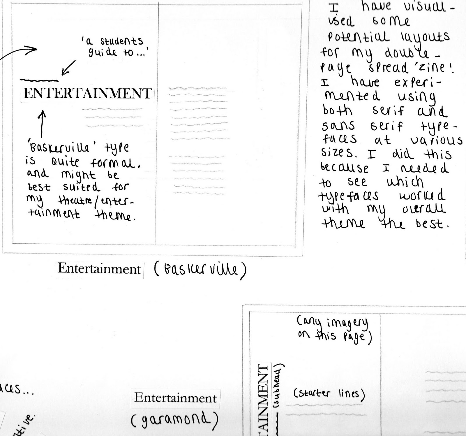
 Theatre Entertainment DPS

I have finally reached an outcome for my theatre entertainment layout. After alot of alterations and experimentation, I have managed to produce a DPS that reflects my theme through careful use of typography and visual imagery. By adding emphasis on certain words, this captures the audiences attention and provokes further thought.

Throughout the spread, I have used wacky typeface styles to promote the theme of dramatic showbiz action. On contrast, for the paragraph content I have used the Century Gothic typeface in various thicknesses to balance out the nature of the DPS. I think that the small visual elements are effective because they suggest a sense of glamour, and allow the audience to envision the theatre environment with ease.


Now that I have completed my 'Horizon' titlepage and my two DPS layouts, I will prepare to present my work on mountboards for assessment! Hopefully my grade will reflect how hard I have worked towards producing good outcomes! :)

Sunday 4 December 2011

'Hello and Welcome' to 'Horizon'...


For the second part of my typography brief, I am required to produce an introductory 'Hello and Welcome' DPS layout consisting of a 600 word introduction to the zine. This will be followed by a front cover design, reading the title for the magazine 'Horizon' or an alternative title of my choice. I started to produce some initial thumbnail sketches for both, which are reminiscent of my theatre theme.


Initial visuals for my 'Hello and Welcome' introduction spread. I experimented with composition and type prominance, and explored various alternatives regarding the overall appearance of the piece.


I took one of my thumbnail sketch ideas into Indesign and began to develop it. For the first paragraph I used a more prominant tone of type, to create a contrast between the rest of the writing. The bold subtitles are very theatrical-style which helps to add interest and excitement to the piece.


For this layout I have incorporated a formal serif typeface in the introductory paragraph to communicate the 'formal' feel of the theatrical experience. In contrast, I have used a more basic typeface for the rest of the paragraph text. I think this varied range of styles is effective in the design.


These are my visuals for the front page design of my zine. I have personalized the title and made it more specific to my theme by changing 'Horizon' to 'The City of Wolverhampton-Where theatre showbiz comes to life'. I have tried to approach my designs with an open mind, to achieve the best possible results.


Here are two alternative designs for my front page, created using Indesign software. The left hand design has a grid-formation background which is intended to be reminiscent of a pixel theatre screen. However I felt that the complex background overshadowed the rest of the layout content, so I experimented with a more ordinary, basic style.

The next step is to revisit some of my design ideas, and choose the most successful content to create my final theatre zine outcome!

Sunday 13 November 2011

Showbiz time!


I sought advice from the course leader Jeff leak, who advised me to explore a site called 'fontsquirrel' which proved to be extremely useful for the development of my work. He suggested that I should perhaps reconsider my typeface choices, as they did not seem suitable for my theme. Jeff looked at my initial layouts and advised me to alter my alignments, and perhaps take my theatre theme into more consideration. I drew up some potential improved layouts, and then created them in Indesign...


I decided to explore some of the exciting typefaces on the Fontsquirrel website, and download them for my own personal reference. I then incorporated some of them into my layouts, which enhanced the appearance and overall composition of my ideas. I feel that I have been able to progress much more this week with my work, and I am more confident when experimenting with new possibilities.


I wanted to reflect the showbiz glamour and excitement of the theatrical experience through my layouts. I started by experimenting with the curtain lines in photoshop, using gradients to give a more realistic impression. This gives the entire piece a more themed, professional look. I added subtle elements that are reminiscent of theatre architecture such as spotlights, and I incorporated bordered boxes outlined with dots for text. This design is much more imaginative than my previous ones, however I think that compositionally it is weak. The layout of text could be more well considered.


For this layout, I used a fontsquirrel typeface called 'Impact label' which places a dramatic poster-style black box around text. I wanted to enhance certain keywords, like the titles 'Grease' and 'theatre experiences'. I chose the 50's style 'brush script MT' main title typeface because it brings a fun, quirky quality to the appearance of the layout. Each section of words is presented at a certain angle on the pages, communicating a dramatic 'broadway advertisement' impression. This layout is the most exciting, and the most successful. However, I still feel that it needs to be adjusted slightly to fit the brief criteria.


The next step is to tackle part two of the brief, which will involve creating an A4 size front cover for my DPS spread. I will experiment with some thumbnail visual ideas this week!

Monday 7 November 2011

Final DPS layout practice

Indesign DPS layout Ideas...

After experimenting with typefaces and compositional factors on my initial design sheets, I decided to begin applying these ideas to an Indesign layout format. I used important elements such as specific theatre show titles and decorative theatre pattern to communicate my theme. Some of the text was intentionally made more prominant to catch the viewers eye, in a very exaggerated showbiz fashion...

(Initial DPS layout idea)
I think that this first draft is weak in terms of composition and excitement. The text seems randomly placed, and could be positioned more appropriately in relation to the theme. I think that the 'pristina' typeface works well for communicating the grand, fancy element of theatre architecture. I also think that the gradual incline of paragraph text above the theatre seat image is unusual and thought provoking.


(Developed DPS layout idea)
This DPS layout is an improved version of the first. This time I have paid closer attention to the hierachy of the piece, and how it could be used to enhance more important keywords. These will provoke interest from the viewer, and encourage them to read further. Words such as 'excitement' and 'experience' are printed in a larger typeface, to contrast with the rest of the text. These subtle changes make this layout more successful, and more easily readable to the audience.


(Final DPS layout idea, combination of both serif/sans serif typefaces used)
This is a more finalized version of the previous layout. I thought that the right-hand page of the DPS lacked consistent content, and there appeared to be little connection between the two adjacent pages. I chose keywords from the paragraphs and increased the size and thickness of the typeface. Then I positioned these letters in the empty area on the right-hand page to create a consistent spread of text. The theatre seat image is positioned at a slight inwards angle, which leads the viewers eye into the opposing pages content. The pristina/century gothic typefaces used are maintained throughout the DPS, and allow for a subtle simplicity. Although this layout is the most successful yet, I still feel that there are compositional/typeface elements which could be improved in further design layouts.

My next step is producing a final outcome visual for my DPS freshers zine, which I hope to complete within the next few days! :)

Experimenting with typography layouts...

In response to my theatre research, I came up with some potential DPS layouts on marker paper. I tried to experiment with typefaces, colour, and composition. Here are some of my initial ideas...

(Basic layout for DPS spread)

(Red coloured theatre-themed DPS layout)


I tried to vary the stroke thickness and texture of the type, to best communicate my theme effectively. Through each layout I have tried to incorporate an interesting architectural theatre element, to show my concept ideas. I have produced many varying visuals, which are each differently displayed for experimentation purposes. During this exercise, I came up with some interesting ideas for the final DPS layout. I have tried to take certain elements (like type size/alignment) into account for later use.

Thursday 27 October 2011

Contextual studies gallery visit...

For my contextual studies module, I was assigned the task of exploring Wolverhampton's local art gallery. I received a question sheet which informed me of the information I needed to obtain, and I spent some time addressing these particular requirements.


I visited the Georgian Gallery, the Victorian gallery, the 'BP portrait award exhibition' space and the Ed Ruscha exhibition area. During my visit I took photographs and made brief notes about certain works and my personal opinions of them. Here are some of my favourite pieces!

 
 'Peter Capaldi'
By Daniel Fooks
B.1972 (oil on canvas)


I explored the 'BP portrait award exhibition' room, and discovered this very atmospheric piece. The subtle, varied facial expressions captured my attention instantly and also the composition of the piece allowed me to view the painting in a different way. The colours are deep and complimentary of one another, and they are repeated and applied throughout each image to give a very discreet appearance. The entire portrait showcases a very emotional state of the subject, and how a persons physical appearance can change dramatically according to how they are feeling. This is one of my favourite pieces from the visit, because I was intrigued by its mysterious quality that captures the viewer instantly.


'Wanderflower'
By Harriet White
B.1979 (Oil on panel)

This piece 'Wanderflower' is very expressive and promotes a sense of glamour and showbiz. It is a very unique, outstanding piece of work and varies alot from the other gallery works. The eyes are dramatic and colourful, and draw the viewers attention. The textured, soft white background is very basic which allows us to focus on the facial detail in more depth. There is a delicate, beautiful nature about this piece that I find fascinating.

'Scroobius pip, angles 2010'
By Leigh Glover
B.1981 (oil on canvas)

I like this piece because it has a subtle conflicting nature, but at the same time shows a very peaceful environment. There is a contrast between the elements, which creates visual interest.
The colours are warm and inviting in the foreground, and there appears to be a united link between the characters. However the background creates a very different, negative atmosphere. Two animals are colliding in a vicious battle, with the characters seemingly unaware of the situation. The sky seems overpowering with harsh colours, to reflect the partial brutal nature of the piece.


Tuesday 4 October 2011

Liverpool Tate gallery visit

During my first week at University, I had an opportunity to explore the art galleries on offer in Liverpool.
I spent the majority of my time at the Liverpool Tate gallery, an experience I thoroughly enjoyed. Most of the galleries I have visited in the past have not interested me because they tend to be mostly paintings. I favour sculpture, and I was excited to see some fantastic displays of predominantly sculptural artwork showcased on the various floors. Within this post I have written my thoughts on some of my favourite pieces in the gallery, and why they are interesting to me.

Robert Therrien
No title (stacked plates) 2010.

This sculpture is very overpowering, but so unique.Standing below these unsteady plates gives a feeling of intimidation to the viewer, and the entire exhibition was very similar. I took a close up look of each plate, and each one had a glossy sheen that allowed me to assume they were ceramic. However, after reading the description I discovered that the plates are actually made from plastic.

No Title (Table and Four Chairs)


The opening piece to the Robert Therrien exhibition was this table and chair set sculpture. The exaggerated size was daunting at first, but at the same time very intriguing. Never before have I felt so affected by a piece of art, and it provoked many thoughts. It reminded me of the Alice in wonderland story, about a character being trapped in an oversized world.

No title (large red brick drawing) 2003


This piece was in the same room as the stacked plate sculpture, and is easily overlooked. I was overwhelmed by the oversized furnishings, but I eventually took notice of this subtle piece in the corner. I like the simplicity of it, and it works well as a contrast with the complex nature of the enormous plates.
  
Jean Arp

Pagoda fruit, bronze
Jean Arp's work is about taking objects from real life and reducing them to abstract form. This deformed shape is very unusual for a sculpture, and almost looks human-like. The positioning of the piece on the edge of the box allows the shadows to form in unexpected places. When the light hits the surface, it appears to have a slight rippled, yet smooth texture.
 
Jeff koons

 Three Ball Total Equilibrium Tank (two Dr.J silver series, Spalding NBA tip off) 1985

Jeff Koons has made a series of glass works presenting consumer items in glass cases, removed from any practical purpose. They appear to be in motion, and intrigued me enough to take a closer look. I was somewhat surprised to see that Koons had created such a simple piece of art, as I consider his usual style to be quite wacky.


Salvador Dali
 Autumnal cannibalism

Quote:‘These Iberian creatures, devouring each other in autumn, symbolize the pathos of civil war seen as a phenomenon of natural history.’


This image doesn't do the original painting any justice. The rich tones and colours of the piece are truly fascinating, and the extreme content even more engaging. Naturally I am not in favour of paintings, however Salvador Dali has a certain way of capturing the viewers attention through his undeniably abstract compositions.


Marcel Duchamp

Fountain, 1917

I was interested to see that the famous Marcel Duchamp 'Fountain' piece was at the Liverpool Tate gallery. After seeing various images of this work throughout the years, I always failed to understand the concept or reasoning behind such a piece. I was under the assumption that perhaps witnessing the original item firsthand would allow me to understand its purpose, and that somehow it might have a unique quality about it that cannot be expressed through a photograph. However I do not think that it is visually pleasing, or has any interesting qualities. Possibly one of the most disappointing pieces I have seen. 


A trip to the Arena Theatre...


Today for my project research, I decided to visit the Arena theatre in Wolverhampton as part of my entertainment theme. I was aiming to get some shots of the layout/architectural structure of the theatre, and the staff were kind enough to assist. My thoughts are to combine my ideas of both architecture and entertainment, and communicate this through my type choice and imagery on my DPS (double page spread) zine. I gathered some various shots but found that this theatre was more basic and didn't have the grand, decorative architecture i had in mind for my images. I requested a tour of the Wolverhampton Grand theatre which is a much larger building, but i was unfortunately rejected. My next step is to analyze my research and experiment with images, layouts, and type.

Thursday 29 September 2011

Exploring the black country

Architectural drawings


Entertainment location sketches


Here is some of my most recent work for my type fundamentals project. I am required to discover and collect visuals/information on a particular aspect of Wolverhampton that will appeal to freshers students, and create a double page spread including text and imagery based on my chosen topic. Initially I decided to take a tour of Wolverhampton and collect photographs/drawings, focusing mainly on architecture and entertainment (haven't quite decided which one to choose yet) However I feel that I have gathered predominantly visual evidence, and perhaps a re-visit to the town is necessary. During my next visit, I hope to collect leaflets and maybe even take tours of the theatre, to get a clearer idea of how words and typography are used to advertise shows/entertainment. After that, let the design work commence!

Tuesday 27 September 2011

A smile in the mind...

During my typography session, my tutor suggested this book for inspiration. It arrived in the post yesterday, so hopefully will be helpful when im stuck for ideas!