Labels

Wednesday, 22 February 2012

Mindmaps and idea generation!


(Animation mindmap)


(Initial idea sketches)

After weeks of learning the basics of Adobe flash, I have finally been assigned my main brief for the Dynamic Imagery module - Animation! I am required to produce a video that is a minimum of 1 minute in length, and has a narrative with accompanying sounds. I began by brainstorming 'Narrative' and all the things I could associate with it. I sought inspiration from the internet in terms of youtube videos, and found some that captured my attention. 

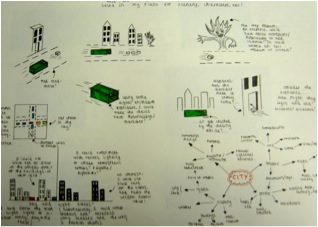
I also created a sheet of initial sketch ideas with a small mind map, further communicating my intentions for the animation.   

Wednesday, 15 February 2012

Magazine layouts for inspiration


In order to gain a sense of how architecture magazines are structured compostionally, I went out and purchased a copy of 'Blueprint' architecture. Here I have selected some of the most inspiring, colourful examples of layouts which I will use for inspiration within my work.

I like the contrasting elements within this piece. The thick coloured borders suggest a more modern style of design, which looks quite effective. Also I like how some images are kept boxed and constrained, whereas others are almost free-floating on the page. This ensures the layout doesn't appear too chunky or tightly structured.

(Thumbnails for DPS)


Here are some of my Initial thumbnails. I selected various elements that I thought were interesting in the Blueprint magazine, and recreated them on layout paper. During feedback sessions I was advised to do more free-hand layouts to allow for more flexibility with my design work. I find working free-hand quite difficult, however I will try to get into the habit of not using a ruler!

Wednesday, 8 February 2012

Exploring Wolverhamptons architecture...


('The Royal London' pub)


(Railway station carpark - Modern Brutalist)


(Old post office - Victorian)


(Chubb's Lock - Victorian)


(Molineux Hotel - Georgian)


(Observational architectural sketches)

For my 'Experimental Type' brief, I am required to produce a front cover and 2 DPS layouts for a magazine called 'Arkitekt'. It is based on architecture and aimed at aspiring architects and designers, and my aim is to create a display of contemporary pages. I started out by exploring the local city of Wolverhampton's buildings, and studying the various architectural elements within them. Above are some of the best photographs I took, and I also did some observational drawings of some key features.  

Sunday, 11 December 2011

Final outcomes....

Horizon Titlepage

After much consideration of my thumbnail visuals and ideas, I eventually produced my 'Horizon' student zine titlepage. It consists of a very theatrical-style theme, with a unique contemporary twist that is aimed at fellow young freshers students. The bold 'Horizon' heading is positioned on the left hand side, with wide spacing inbetween each letterform. The unusual nature of the typeface adds to the modern look of the zine, and effectively communicates what exciting entertainment the City of Wolverhampton has on offer for students!
'Hello and Welcome' DPS

This is my final design outcome for my 'Hello and Welcome' DPS. It is simple yet effective, and includes some formal subheadings which work well in contrast with the Century Gothic typeface that is evident within the paragraphs. Throughout the entire zine, each page is linked by a relationship between the typefaces used and the general visual appearance. The beginning paragraph has a thicker tonal definition to reinforce prominance, as this introductory section is crucial.


 Theatre Entertainment DPS

I have finally reached an outcome for my theatre entertainment layout. After alot of alterations and experimentation, I have managed to produce a DPS that reflects my theme through careful use of typography and visual imagery. By adding emphasis on certain words, this captures the audiences attention and provokes further thought.

Throughout the spread, I have used wacky typeface styles to promote the theme of dramatic showbiz action. On contrast, for the paragraph content I have used the Century Gothic typeface in various thicknesses to balance out the nature of the DPS. I think that the small visual elements are effective because they suggest a sense of glamour, and allow the audience to envision the theatre environment with ease.


Now that I have completed my 'Horizon' titlepage and my two DPS layouts, I will prepare to present my work on mountboards for assessment! Hopefully my grade will reflect how hard I have worked towards producing good outcomes! :)

Sunday, 4 December 2011

'Hello and Welcome' to 'Horizon'...


For the second part of my typography brief, I am required to produce an introductory 'Hello and Welcome' DPS layout consisting of a 600 word introduction to the zine. This will be followed by a front cover design, reading the title for the magazine 'Horizon' or an alternative title of my choice. I started to produce some initial thumbnail sketches for both, which are reminiscent of my theatre theme.


Initial visuals for my 'Hello and Welcome' introduction spread. I experimented with composition and type prominance, and explored various alternatives regarding the overall appearance of the piece.


I took one of my thumbnail sketch ideas into Indesign and began to develop it. For the first paragraph I used a more prominant tone of type, to create a contrast between the rest of the writing. The bold subtitles are very theatrical-style which helps to add interest and excitement to the piece.


For this layout I have incorporated a formal serif typeface in the introductory paragraph to communicate the 'formal' feel of the theatrical experience. In contrast, I have used a more basic typeface for the rest of the paragraph text. I think this varied range of styles is effective in the design.


These are my visuals for the front page design of my zine. I have personalized the title and made it more specific to my theme by changing 'Horizon' to 'The City of Wolverhampton-Where theatre showbiz comes to life'. I have tried to approach my designs with an open mind, to achieve the best possible results.


Here are two alternative designs for my front page, created using Indesign software. The left hand design has a grid-formation background which is intended to be reminiscent of a pixel theatre screen. However I felt that the complex background overshadowed the rest of the layout content, so I experimented with a more ordinary, basic style.

The next step is to revisit some of my design ideas, and choose the most successful content to create my final theatre zine outcome!