Labels

Showing posts with label 4VC004. Show all posts

Sunday, 6 May 2012

Final Arkitekt DPS layouts!


Here are my final designs for the Arkitekt magazine...
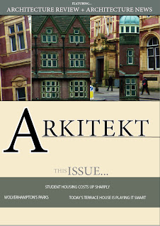

(Front cover)

I have altered my spreads in various ways, for example the colours are more neutral and allow the overall appearance to appear more professional. Also I have elongated the photos on the front cover, which are now more prominent.


(Architecture Review DPS)

I have included tabs along the left hand side of the page, which makes the entire composition look as though it belongs in a magazine. I have also removed the dark blocks which surrounded the text, as I felt that they were too overpowering for the spread.
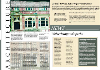

(Architecture News DPS)

I have used only one copy of the house at full opacity, as the second lowered opacity copy didn't relate to the article or have much relevance. Instead I have decided to incorporate an image of a georgian hotel, which is located directly behind the georgian architecture article. The spread is easier to understand this way, and allows the reader to navigate around the page effectively. I am pleased with the end result, as the colour theme and typeface choices are some features which make the magazine appear interesting and contemporary.


Sunday, 1 April 2012

Final DPS indesign practice!


(Title page 'Arkitekt')


(Architecture review DPS 1)

(Architecture news DPS 2)

After some consideration of the design of my layouts, I used Indesign to inject some more exciting visual elements into them. Instead of using my sketches, I decided to enhance my work by adding the photographs I took but with a high level of contrast. I have also tried to use a colour scheme which appears consistent throughout all of the pages, indicating they are part of a set. My use of photographs has improved my DPS layouts, as they look more formal and appropriate for a magazine. 

After my discussion session, I was advised to reconsider my choices of typeface. This is because it needs to be aimed at the target audience more effectively, and the current choice seems lacklustre.
Jeff advised that I be more experimental in terms of composition and colour, two elements that I will take into account when designing my next series of new and improved DPS layouts!   

Friday, 16 March 2012

Initial DPS's


I started using Indesign after one of our practice sessions, and began to arrange the text in various ways. I experimented with type and constructed some initial layouts. I also decided to incorporate some of my architecture sketches into it, however they don't look as professional as I suspected they would. Perhaps I could later use them in my ideas, but in a much more subtle manner?


These Indesign layouts are for the carbuncles text, this time using my images but only in a small area. I think that these layouts are good for initial text positioning experimentation, however they will need editing to allow for a more colourful visual appearance...

Wednesday, 15 February 2012

Magazine layouts for inspiration


In order to gain a sense of how architecture magazines are structured compostionally, I went out and purchased a copy of 'Blueprint' architecture. Here I have selected some of the most inspiring, colourful examples of layouts which I will use for inspiration within my work.

I like the contrasting elements within this piece. The thick coloured borders suggest a more modern style of design, which looks quite effective. Also I like how some images are kept boxed and constrained, whereas others are almost free-floating on the page. This ensures the layout doesn't appear too chunky or tightly structured.

(Thumbnails for DPS)


Here are some of my Initial thumbnails. I selected various elements that I thought were interesting in the Blueprint magazine, and recreated them on layout paper. During feedback sessions I was advised to do more free-hand layouts to allow for more flexibility with my design work. I find working free-hand quite difficult, however I will try to get into the habit of not using a ruler!

Wednesday, 8 February 2012

Exploring Wolverhamptons architecture...


('The Royal London' pub)


(Railway station carpark - Modern Brutalist)


(Old post office - Victorian)


(Chubb's Lock - Victorian)


(Molineux Hotel - Georgian)


(Observational architectural sketches)

For my 'Experimental Type' brief, I am required to produce a front cover and 2 DPS layouts for a magazine called 'Arkitekt'. It is based on architecture and aimed at aspiring architects and designers, and my aim is to create a display of contemporary pages. I started out by exploring the local city of Wolverhampton's buildings, and studying the various architectural elements within them. Above are some of the best photographs I took, and I also did some observational drawings of some key features.